- BI dashboards help decision-makers grasp insights and trends faster by presenting data in a visual, easy-to-understand manner.
- Interactive and drill-down capabilities of business intelligence dashboards allow users to filter data from multiple sources and gain deeper insights on specific areas of interest .
- BI dashboard integration with AI and advanced analytics helps organizations access real-time reports, uncover hidden insights, patterns and trends for strategic decision-making .
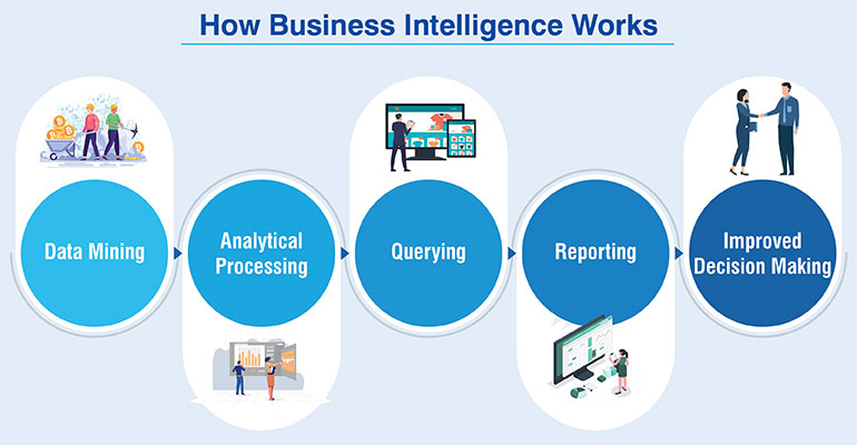
Business intelligence dashboards have transformed the way businesses leverage data. Business strategists can now find patterns, monitor KPIs, visually analyze data and make process interventions without waiting for the IT department to connect the dots. And they can do it in real time.
Organizations are unlocking the real value of their data with business intelligence dashboards. They can now uncover crucial patterns about markets and their businesses with graphs and charts and connect the dots more easily. They can also manipulate the data in a way they couldn’t do earlier with traditional tools. Today’s business intelligence dashboards allow clearer tracking and comparison of KPIs and business metrics, simplify data integration and analysis, and offer substantial help in making productive business decisions.
Table of Contents
- What are business intelligence dashboards?
- The need for a business intelligence dashboard
- Key features of business intelligence dashboards
- Benefits of business intelligence dashboards
- 4 main types of business intelligence dashboards
- Application of BI dashboards across roles and functions
- A Look at major BI tools
- Best practices for creating high-performing BI Dashboards
- Real world examples of BI dashboards
- BI Dashboards – Key takeaways
Custom business intelligence dashboards save decision makers numerous hours otherwise spent on poring over data from sources like on-premise, cloud apps, social media and more. They can quickly understand the success of marketing campaigns, customer reactions, sales revenues and other key performance indicators (KPIs).
In this guide, we’ll take you through what constitutes business intelligence dashboards, how they bridge data silos and the best practices associated with using BI dashboards.
What are business intelligence dashboards?
Essentially, a business intelligence dashboard is a data visualization and analysis tool. It is designed to meet your specific goals and compile and display data from different datasets according to analytic needs. Traditionally, this analysis was done manually with bulky spreadsheets. Today, custom BI dashboard tools aid professionals to see, evaluate, strategize, and act in a more intuitive way.
The need for a business intelligence dashboard
Most companies lack the essential in-house knowledge, skills, and resources to visualize their data, identify meaningful correlations and generate real-time dashboards. In some companies, different teams make different reports for various business requirements, resulting in a complex cauldron of inconsistent data, different interpretations, inaccuracies and faulty insights.
Inaccurate data visualization may hide critical information on market trends, risks, opportunities, and may lead to wrong decisions and unnecessary costs.
BI dashboards help non-technical users to:
- Identify positive and negative market trends to take immediate action
- Establish a collaborative culture through increased accurate information sharing
- Track company performance, customer satisfaction and business operations
Business intelligence dashboards present complex data in a simplified and interactive way, so that it can be quickly and easily analyzed by anyone. They help to make sense of data by putting it in proper perspective for drawing actionable insights with ease. And so, business intelligence dashboards become necessary to unravel the relationships between seemingly disparate pieces of information found across a business.
Key features of business intelligence dashboards
Some of the most useful features of business intelligence dashboards include:
- Easy to use and highly configurable interface
- Interactive dashboard templates
- Drill-down capabilities and filters
- Ability to pull out historical and real-time data
- Ability to access through web-based browsers
- Standardized templates
- Real-time reports and alerts
All these features offered in BI dashboards actively contribute to improve usability and visual appeal for a focused view of the information being contextualized.
Benefits of business intelligence dashboards
BI dashboards are connected to data warehouses, data marts or data lakes; as well as operational systems, industrial equipment and internal and external data sources within the company. These sources may include structured, unstructured or semi-structured data.
Here are some of the main benefits offered by a BI dashboard:
- Ease of communication: Using charts, graphs and reporting tools, business intelligence dashboards make it easy to communicate insights across teams. For example, pie charts can depict percentages in a more impactful way than a simple table.
- Better business decisions: Each business decision is as good as the numbers, data and facts backing it up. As businesses grow, insights derived from BI dashboards help business leaders navigate in the right direction, bring necessary changes, implement right strategy or adopt new tools.
- Tracking of business metrics: Every business needs to continuously track their key performance indicators (KPIs) and other metrics. This helps to identify areas where a business is performing well and where it needs to improve. BI dashboards provide interactive data updated in real-time in a unified view, and make it easier to monitor performance and take informed action.
- Monitoring of trends: In a dynamic market, companies need to spot market trends quickly by monitoring customer behavior and patterns and adopt new strategies in time. Business intelligence dashboards help exactly to do this. They help assess company/employee performance, identify effective marketing and sales strategies, and reduce churn rate.
4 main types of business intelligence dashboards
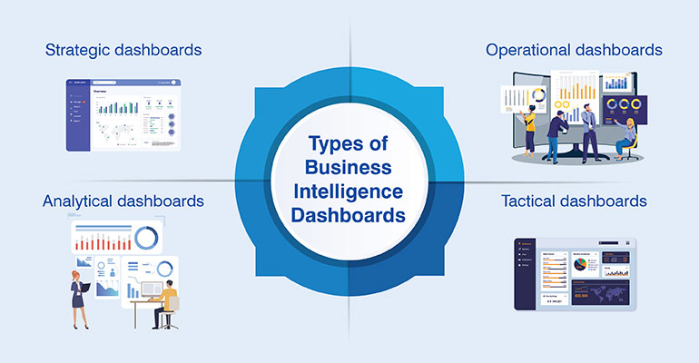
There is no one size-fits-it-all business intelligence system. The ‘intelligence’ arrives when data is segregated and analyzed based on its purpose. This is achieved through business intelligence dashboards of the following types:
Strategic dashboards
Mostly used by a company’s top or mid-management teams, strategic dashboards provide a bird’s-eye-view of a business organization and its performance. The data used here is complex as it is collected from different cross-functional areas.
Instead of providing insights for day-to-day decisions, such dashboards are useful for month-on-month, quarterly or yearly overview of revenue, performance versus goals, seasonal fluctuations, etc. It helps you make focused and strategic decisions about your products and services, as also your organization’s long-term goals and strategies.
Operational dashboards
As the name suggests, operational dashboards are used for tracking business operations. They are used by teams in marketing, logistics, sales, human resources, supply chain or manufacturing. Based on real-time data, they enable mid and senior management leaders to identify and resolve issues quickly.
Analytical dashboards
Built at an intersection of strategic and operational dashboards, analytical dashboards provide a comprehensive view of vast amounts of data. Used by data analysts, these dashboards are very helpful when a company needs to solve a complex problem and needs visualization to analyze the data. Such dashboards mostly rely on historical data to identify trends, compare variables, and generate predictions.
Tactical dashboards
Unlike analytical dashboards, tactical dashboards are used to monitor metrics specific to a team or business, and for defined targets. Used by mid-management executives, such dashboards are more interactive, and contain various filters and segmentation to drill down into datasets. For example, it can be used by product managers to keep a tab on product performance vs. targets, user demographics, region, etc.
Application of BI dashboards across roles and functions
Business intelligence dashboards are used everywhere in a company. Whether it is a strategic decision at enterprise level or at individual KPI level, here are some examples of how business intelligence dashboards are used by different teams:
Sales and marketing
Sales and marketing dashboards depict insights on cost per lead, product or retail sales, customer lifetime value, customer profitability and various other KPIs. Managers can easily get an overview of sales pipelines, track campaign metrics, sales rep performance and revenue vs. targets using these dashboards.
Finance
Accounts or finance teams need dashboards for KPIs like revenue, operational expenses, profits to cash holdings, assets, working capital and more to monitor business performance and for future financial planning.
Human resources
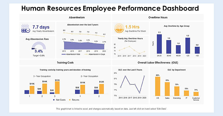
Used by HR managers and executives, these dashboards provide insights on employee productivity, salary statistics and demographics, hiring metrics, employee satisfaction and costs in employee management and engagement activities.
IT
Any SME or big company’s IT departments, and network teams are the primary users of BI dashboards. It helps them monitor various IT operations like network usage, systems, databases, available IT resources, performance, security and overall technology expenditure.
Analysts
Data analysts and data science teams are critical BI users for any company. They use these analytical tools to decipher opportunities from existing processes and make recommendations for change to the top management
The demand for mobile-friendly dashboards is also on the rise. Ensuring dashboards are displayed properly to BI users on smartphones and tablets increases usability and speed of decisions. In order to become a data-driven company, it is essential for each department to take maximum advantage of insights gathered from BI dashboards.
A Look at major BI tools
While there are numerous BI tools available in the market today, we’ve listed the most commonly cited tools here without assigning any order priority.
- Microsoft Power BI: Integrating seamlessly with Excel, Azure, Access and the larger Microsoft ecosystem, Power BI comes with built-in AI capabilities, data connectors and end-to-end data encryption.
- Google Data Studio: A highly interactive data visualization tool from Google, Data Studio offers easy integrations with the entire Google ecosystem. It also offers a huge library for reporting templates and greater community support.
- Tableau: Widely known for its user-friendly data visualization capabilities, Tableau is a leader among a plethora of business intelligence tools. It seamlessly integrates data from multiple databases and makes it highly useful for data scientists, analysts, and developers.
- Sisense: Also known as Sisense for Cloud Data Teams, it is an enterprise tool used by companies to make reports on the go. Users can easily use SQL, Python and R on the platform.
- Metabase: It is an affordable, free and open-source BI tool that is used for day-to-day business questions. However, it offers little to no-customer support, but it is full under control of users.
While customization, interactivity, features, widgets, usability and visual appeal add to the power of BI dashboards, there are certain issues to watch out for, like:
- Building cluttered and flashy dashboards
- Embedding too much information in a single screen
- Not providing the right context with the right KPIs to relevant users
- Using clashing or misinterpreting data or not including relevant data
- Having huge labels, headlines or unnecessary gridlines create visual clutter
A well-designed and easily understandable dashboard is built in a way so the right data is visible to the right user in the right context or manner. Different components should easily blend with each other and present an all-inclusive overview along with drill-down capabilities for end-users to see more granular data.
Best practices for creating high-performing BI Dashboards
- Get a clear idea on what type of information you want to include, consider the type of data involved and strategize on what type of insights should pass on to the users.
- Identify the best-fit dashboard you can use for your purpose. For example, choose release management KPI dashboard if you want to monitor patterns in your releases over time. If you wish to improve value delivery, plan and make wise investment decisions — a value stream flow metrics dashboard will work right.
- Choose the right visualization tool, metrics and dimensions to show comparisons, correlations, and distributions of data. Don’t miss anything essential to convey the story lying hidden in your data.
- Know your audience, their exact needs and understanding level to use visualization that is easy to comprehend.
- Review and update dashboards regularly. Like most software development processes, dashboard designing, too, is an iterative process. Choose feasible and scalable dashboards that meet your changing needs.
- Engage your users through the art of storytelling in your dashboards. Readers usually scan from top left to right and then bottom, ensure your dashboards are designed as per this pattern.
Real world examples of BI dashboards
Well-designed and articulate BI dashboards have added real value to the operations of the world’s leading brands. They help to drive customer loyalty, streamline processes, reduce IT dependency, and increase operational efficiency. Here are a few examples of BI dashboards used by big companies:
American Express
There was a trend showing 24% of all Australian users of American Express closed their accounts in maximum four months. The financial industry giant used this information and took the right steps to reduce churn rate. BI dashboards helped the company to detect fraud, protect customers, develop new payment service methods and market customized offers.
Coca-Cola
With an envious social media presence of 35M Twitter followers and 105M Facebook fans, Coca-Cola uses BI to track and analyze its social media data. With an AI-powered image recognition mechanism, the company receives insights on who, where and how is posting photos with their drink. This information helps them to create targeted ads that are four times more successful than any general ad.
SKF
This Swedish manufacturer was unable to forecast product demands accurately due to use of outdated and complex Excel sheets. They implemented a business intelligence system to move away from Excel and access easy-to-understand reports and dashboards. With a centralized data system, the manufacturer has achieved accurate forecasts and a clear sync between different departments.
Expedia
Known as the parent-company to TripAdvisor and Hotwire, Expedia lacked visibility into the voice of customer. They manually aggregated data and were unable to analyze customer data, discover customer behavior trends and patterns. Owing to business intelligence dashboard, their customer service team now sees how well they are doing against pre-defined KPIs in real-time.
BI Dashboards – Key takeaways
- Business intelligence dashboards are comprehensive data visualization tools to connect datasets, data warehouses or databases.
- BI dashboards provide the real picture or insights into business operations, processes, future trends, market dynamics, variations in demand and supply and help to form decisions based on actual data.
- Tracking of KPIs and other vital metrics through dashboards allow users to create performance benchmarks, spot market trends, increase compliance, make relevant changes and achieve goals.
- Effective business strategies can be built using objective understanding of markets, customers, business and operational processes and business performance.
- Allowing complex data to be aggregated in a single place, BI dashboards serve different purposes for different teams. The key features include interactivity, customizable interface, standard templates and collaborative facility.
- Crucial advantages of BI dashboards include data visibility, accurate and engaging reports and streamlined processes.
- Put simply, BI dashboards build an engaging and easy-to-grasp story for its users out of raw data.
Wrap Up
Business intelligence dashboards create, collate, and communicate your data for actionable insights. It is acknowledged as one of the most efficient ways to visualize business data. Choose a business intelligence dashboard partner who truly understands what you need and how you need it. Business intelligence dashboards can spell the difference between success and failure, between stagnancy and growth, or between being average and a market leader. So, they need due care and attention in their creation and design. And the investment is negligible when weighed against the advantages and returns of a proper BI dashboard.